Code
library(tidyverse) # For data manipulation and visualization
library(tidytuesdayR)        # For accessing TidyTuesday datasets
library(showtext)            # For working with fonts
library(glue)                # For text formatting
library(ggtext)              # For enhanced text formatting in ggplot2

# Load Data
tuesdata <- tidytuesdayR::tt_load(2023, week = 40)
##
## 	Downloading file 1 of 2: `grants.csv`
## 	Downloading file 2 of 2: `grant_opportunity_details.csv`
grant_opportunity_details <- tuesdata$grant_opportunity_details # Load Fonts and Define Colors # Fonts are loaded and colors are defined for text and symbols in visualizations. font_add_google("Poppins", "poppins") font_add('fa-reg', 'c:/Users/info/OneDrive/Dokumente/fonts/Font Awesome 6 Free-Regular-400.otf') font_add('fa-brands', 'c:/Users/info/OneDrive/Dokumente/fonts/Font Awesome 6 Brands-Regular-400.otf') font_add('fa-solid', 'c:/Users/info/OneDrive/Dokumente/fonts/Font Awesome 6 Free-Solid-900.otf') showtext_auto() bg <- "#e9c46a" # background color col1 <- "#264653" # for text col2 <- "#2a9d8f" # for text col3 <- "#e76f51" # Define Symbols # Symbols are defined using HTML-style code with appropriate colors and fonts. twitter <- glue("<span style='color:{col3};font-family:fa-brands;'></span>") mastodon <- glue("<span style='color:{col3};font-family:fa-brands;'></span>") link <- glue("<span style='color:{col3};font-family:fa-solid;'></span>") data <- glue("<span style='color:{col3};font-family:fa-solid;'></span>") quote <- glue("<span style='color:{col3};font-family:fa-solid;'></span>") space <- glue("<span style='color:{bg}'>-</span>") space2 <- glue("<span style='color:{bg}'>--</span>") # This creates horizontal lines for formatting. # Define Title t <- "Distribution of Posted Grant Opportunities by Eligibility Criteria" s <- "Analysis of Eligibility Criteria for Grant Opportunities" cap <- glue("{twitter}{space2}@web_design_fh{space2} {space2}{mastodon}{space2}@frankhaenel @fosstodon.org{space2} {space2}{link}{space}{space2}www.frankhaenel.de<br> {data}{space2}grants.gov") eligible_groups <- c( "Individuals", "State Goverments", "County Goverments", "Independent School Districts", "City Or Township Governments", "Special District Governments", "Native American Tribal Governments", "Native American Tribal Governments", "Nonprofits", "Nonprofits", "Profit", "Small Businesses", "Private Institutions Of Higher Education", "Public Institutions Of Higher Education", "Public Indian Housing Authorities", "Others" ) column_name <- c( "eligibility_individuals", "eligibility_state_governments", "eligibility_county_governments", "eligibility_independent_school_districts", "eligibility_city_or_township_governments", "eligibility_special_district_governments", "eligibility_native_american_tribal_governments_federally_recognized", "eligibility_native_american_tribal_organizations_other", "eligibility_nonprofits_501c3", "eligibility_nonprofits_non_501c3", "eligibility_for_profit", "eligibility_small_businesses", "eligibility_private_institutions_of_higher_education", "eligibility_public_institutions_of_higher_education", "eligibility_public_indian_housing_authorities", "eligibility_others" ) # Create a dataframe with eligible_groups and column_name df <- data.frame(eligible_groups, column_name) # Calculate the count of grant opportunities for each eligible group df %>% mutate(count = sapply(column_name, function(col) sum(grant_opportunity_details[[col]]))) %>% group_by(eligible_groups) %>% summarize(opportunities = sum(count)) %>% ggplot(aes(x = eligible_groups, y = opportunities)) + geom_col(color = col2, fill = col2) + geom_text(aes(x = eligible_groups, y = 10, label = eligible_groups),color = "white", hjust = 0) + labs(title=t, subtitle = s, caption = cap) + coord_flip() + theme_void() + theme( plot.margin = margin(30, 30, 30, 30), panel.background = element_rect(fill=bg, colour = bg), plot.background = element_rect(fill=bg), plot.title = element_markdown(size = 15, hjust = 0.5, lineheight = 1.3, family = "poppins", color = col1), plot.subtitle = element_markdown(size = 12, hjust = 0.5, lineheight = 1.3, family = "poppins", color = col1), plot.caption = element_markdown(size = 10, hjust = 0, lineheight = 1.3, family = "poppins", color = col1), axis.text.y = element_blank(), axis.text.x = element_markdown(size = 10, hjust = 0, lineheight = 1.3, family = "poppins", color = col1), panel.grid.major.x = element_line(color = col1, size = 0.5) )

Code Documentation
This R code performs an analysis of grant opportunities based on their eligibility criteria. It utilizes various libraries and fonts for data visualization and formatting.
Libraries Used
tidyverse: For data manipulation and visualization.tidytuesdayR: For accessing TidyTuesday datasets.showtext: For working with fonts.glue: For text formatting.ggtext: For enhanced text formatting in ggplot2.
Data Loading
The code loads data from the TidyTuesday dataset for the year 2023, week 40, specifically the grant_opportunity_details dataset.
Fonts and Colors
Custom fonts are loaded using the font_add function, and colors are defined for text and symbols used in visualizations.
Symbols
Various symbols are defined using HTML-style code with specified colors and fonts. These symbols will be used for text formatting in the visualizations.
Title and Subtitle
The title and subtitle for the analysis are defined. They will be used in the final visualization.
Data Preparation
A list of eligible groups and their corresponding column names is created. These groups will be used for filtering and counting grant opportunities based on eligibility criteria.
Data Analysis
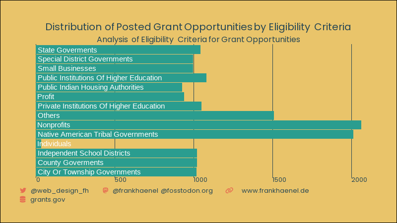
The code calculates the count of grant opportunities for each eligible group by applying filtering and aggregation operations. It uses the ggplot2 library to create a bar chart visualization of the results.
Visualization Styling
The visualization's appearance, including margins, background colors, fonts, and text formatting, is customized to improve readability and aesthetics.
Output
The code produces a bar chart showing the distribution of posted grant opportunities by eligibility criteria, along with the defined title, subtitle, and caption.
For additional details and code comments, please refer to the original R script.
