TidyTuesday is a weekly data project aimed at the R and data science community. Each week, a new dataset is released to provide a fun, collaborative, and educational experience in data wrangling, visualization, and analysis. Participants are encouraged to explore the datasets, share their visualizations, and discuss their findings with the community. The project promotes the use of tidy data principles and the tidyverse suite of packages in R, fostering a culture of continuous learning and skill development.
About the Data
The dataset used in this visualization was compiled from the TidyTuesday {ttmeta} package, which automatically updates with information about the datasets released each week. The data includes information such as the year of release, week number, dataset name, number of variables, and number of observations for each dataset. This compilation provides a comprehensive view of the datasets made available through TidyTuesday over the years.Motivation Behind the Visualization
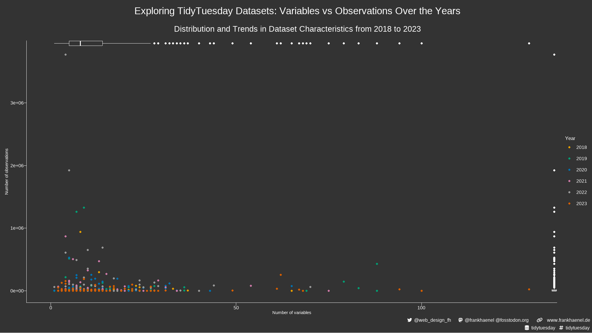
The goal of this visualization is to provide insights into the characteristics of TidyTuesday datasets over time. By plotting the number of variables against the number of observations and highlighting trends over the years, we can gain a better understanding of how the complexity and size of the datasets have evolved. The choice of visualizing the data through scatter plots and box plots allows us to:- Highlight Trends: The scatter plot shows the relationship between the number of variables and observations for each dataset, colored by year. This helps identify any patterns or changes in dataset characteristics over time.
- Understand Distribution: The box plots for the number of variables and observations provide a clear view of the distribution and variability in the dataset characteristics. This can help identify outliers and understand the typical range of dataset sizes.
- Comprehensive Overview: By combining these visual elements, we can present a comprehensive overview of the TidyTuesday datasets, making it easier to compare and contrast different years and datasets.
The Code
# Load necessary libraries for data manipulation, visualization, and styling
library(tidyverse)      # Data manipulation and visualization
library(thematic)       # Theming for plots
library(showtext)       # Custom fonts in plots
library(patchwork)      # Combining multiple plots
library(glue)           # String interpolation
library(ggtext)         # Enhanced text rendering in ggplot2

# Read the TidyTuesday datasets from the provided URL
tt_datasets <- readr::read_csv('https://raw.githubusercontent.com/rfordatascience/tidytuesday/master/data/2024/2024-07-02/tt_datasets.csv')
# Load custom fonts font_add('fa-reg', 'Font Awesome 6 Free-Regular-400.otf') # Regular Font Awesome icons font_add('fa-brands', 'Font Awesome 6 Brands-Regular-400.otf') # Brand Font Awesome icons font_add('fa-solid', 'Font Awesome 6 Free-Solid-900.otf') # Solid Font Awesome icons showtext_auto() # Automatically use showtext for rendering text # Set colors for text and background col1 <- "white" # Text color bg <- "grey20" # Background color # Create styled text using Font Awesome icons twitter <- glue("<span style='color:{col1};font-family:fa-brands;'></span>") # Twitter icon mastodon <- glue("<span style='color:{col1};font-family:fa-brands;'></span>") # Mastodon icon link <- glue("<span style='color:{col1};font-family:fa-solid;'></span>") # Link icon data <- glue("<span style='color:{col1};font-family:fa-solid;'></span>") # Database icon hash <- glue("<span style='color:{col1};font-family:fa-solid;'>#</span>") # Hash icon space <- glue("<span style='color:{bg}'>-</span>") # Spacer element for alignment space2 <- glue("<span style='color:{bg}'>--</span>") # Spacer element for alignment # Titles and caption for the plot t <- "Exploring TidyTuesday Datasets: Variables vs Observations Over the Years" # Title s <- "Distribution and Trends in Dataset Characteristics from 2018 to 2023" # Subtitle cap <- glue("{twitter}{space2}@web_design_fh{space2} {space2}{mastodon}{space2}@frankhaenel @fosstodon.org{space2} {space2}{link}{space}{space2}www.frankhaenel.de<br> {data}{space2}tidytuesday {space2}{hash}{space2}tidytuesday") # Caption with social media and website info # Apply thematic styling for the plot thematic_on( bg = bg, fg = "auto", accent = "auto", font = NA, # Set background, foreground, and accent colors sequential = sequential_gradient(), qualitative = okabe_ito() # Set color schemes ) # Create scatter plot for variables vs observations with custom styling p.1 <- tt_datasets %>% filter(year < 2024) %>% # Filter out data from 2024 ggplot(aes(x = variables, y = observations, color = as.factor(year))) + geom_point() + scale_y_continuous(limits = c(0,3800000)) + # Set y-axis limits scale_x_continuous(limits = c(0,130)) + # Set x-axis limits theme_void() + # Apply a void theme labs(x = "Number of variables", y = "Number of observations") + # Add axis labels theme( axis.title.x = element_text(color = col1), # Style x-axis title axis.title.y = element_text(color = col1), # Style y-axis title axis.line = element_line(color = col1), # Style axis lines axis.ticks = element_line(color = col1), # Style axis ticks axis.ticks.length = unit(0.2, "cm"), # Set axis ticks length axis.text = element_text(color = col1), # Style axis text legend.text = element_text(color = col1), # Style legend text legend.title = element_text(color = col1) # Style legend title ) # Create box plot for the number of variables p.2 <- tt_datasets %>% filter(year < 2024) %>% # Filter out data from 2024 ggplot(aes(x = variables)) + geom_boxplot(color = col1, fill = "grey20") + # Set colors for box plot scale_x_continuous(limits = c(0,130)) + # Set x-axis limits theme_void() # Apply a void theme # Create box plot for the number of observations p.3 <- tt_datasets %>% filter(year < 2024) %>% # Filter out data from 2024 ggplot(aes(y = observations)) + geom_boxplot(color = col1, fill = "grey20") + # Set colors for box plot theme_void() + # Apply a void theme scale_y_continuous(limits = c(0,3800000)) # Set y-axis limits # Combine the scatter plot with box plots as insets p <- p.1 + inset_element(p.2, 0, 0.98, 1, 1) + inset_element(p.3, 0.99, 0, 1, 1) # Add titles and captions to the plot p + plot_annotation( caption = cap, # Add caption title = t, # Add title subtitle = s, # Add subtitle theme = theme( plot.background = element_rect(fill = "grey20", color = NA), # Set plot background plot.margin = margin(10, 5, 5, 10), # Set plot margins plot.title = element_text(size = 25, color = col1, hjust = 0.5, margin = margin(5, 0, 15, 0)), # Style plot title plot.subtitle = element_text(size = 20, color = col1, hjust = 0.5, margin = margin(5, 0, 15, 0)), # Style plot subtitle plot.caption = element_markdown(size = 9, color = col1, hjust = 1, lineheight = 1.3) # Style plot caption ) )

